My Wealth Master
The Company
My WealthMaster was created by an MBA student who struggled to manage his investments efficiently. He was frustrated with the resources already on the market so he built a simple tool to:
Track net worth across multiple assets
Automate a diversified investment portfolio
It’s designed for people who lack the time, knowledge, or resources to hire a personal wealth manager.
My Role
PROJECT: My WealthMaster
TIMELINE: 6 weeks (May-June 2025)
TEAM: 4 designers
MY ROLE: UX/UI Designer - Sandbox concept lead, ISA dashboard design, design system co-creation
TOOLS: Figma, FigJam, ChatGPT, Claude AI, Pen & Paper, Google Forms, Figma Slides
CLIENT: Client project through Experience Haus bootcamp
Approach
I used the double diamond approach to break down the problem solving
Discover
Stakeholder Interview
1
2
3
UNDERSTAND THE REAL WORLD FRUSTRATIONS THAT LED TO MY WEALTH MASTER CREATION
The stakeholder wants the team to grasp the original pain points, clunky spreadsheets, bad UX & inaccessible wealth tool.
AI HAS CHANGED THE GAME & THE OPPORTUNITY
AI tools now make complex features faster and cheaper to build reviving the product with smarter, AI-powered potential.
REDESIGN FOCUS: TRUST, SIMPLICITY & REAL USER PROBLEMS
Why users still prefer Excel?
Building a dashboard that’s clear and motivating
Using AI without overwhelming beginners
Replacing scattered tools with one simple, unified platform
Define
HOW CAN WE HELP HIM?
Provide clear guidance on tax implications to avoid overpaying
Show a simple, transparent view of investment performance now and in the future
Offer smart recommendations during market fluctuations
Compare ISA options and highlight the best fit with confidence
PAIN POINTS
Confused about tax implications of investing; worried about overpaying
Lacks a clear view of current and future investment performance
Unsure how to react during market fluctuations
Wants the best ISA rates for buying a house but lacks confidence in choosing
How might we?
Develop
High impact Low effort matrix
Ideation
1
2
3
User Flow
Sand Box Flow
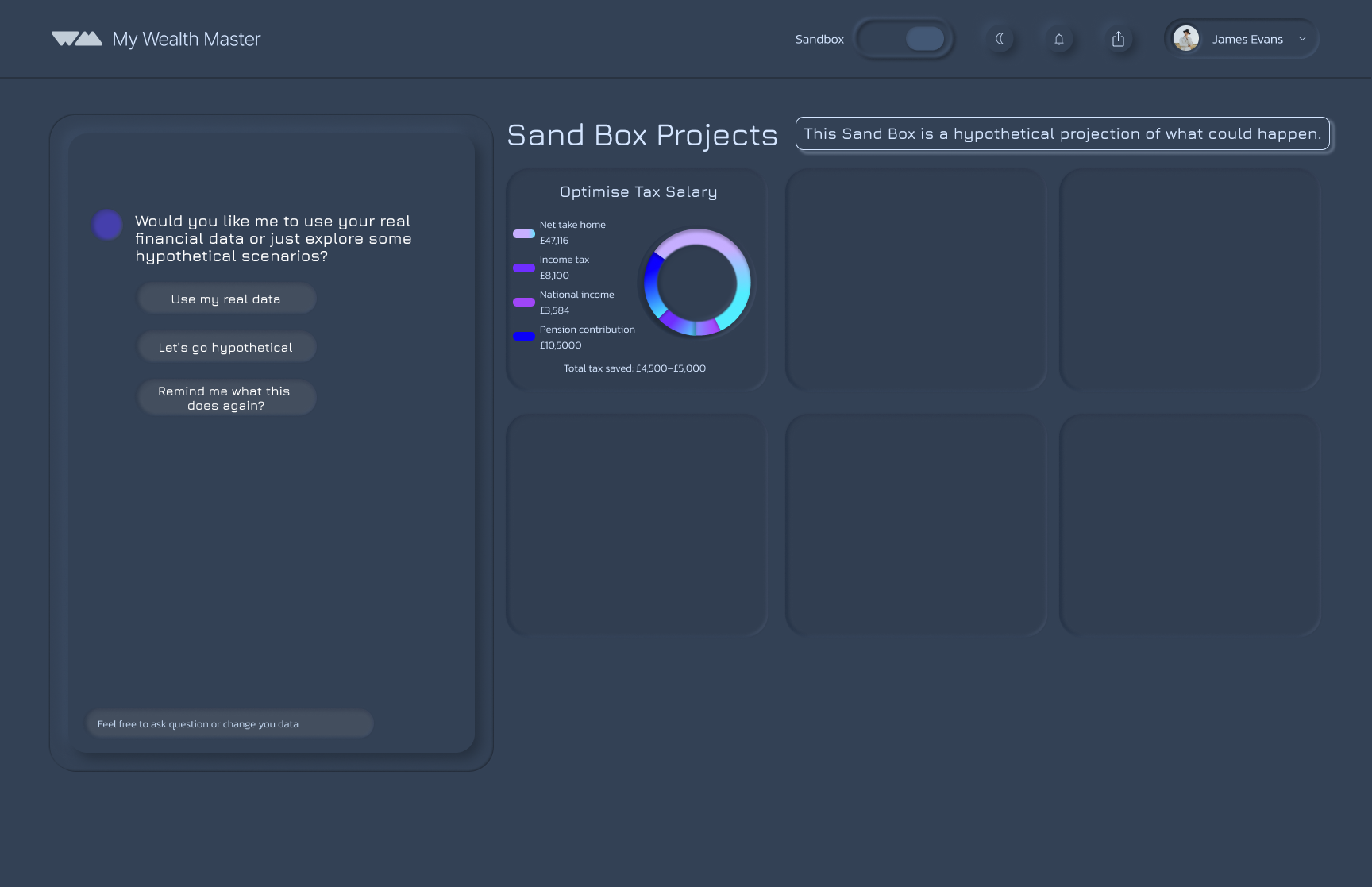
Users can choose whether to use real data or hypothetical data.
Real data or hypothetical takes them into a guided path where they pick a focus area (tax, retirement, home purchase, or a custom goal).
Users answer a set of AI-generated questions so it can understand what you have and how to assist your financial needs
The system generates a personalised financial overview based on the users responses.
Users can choose to view the overview or save it directly to their projects (e.g., a tax-maximisation overview).
Hypothetical data or “Nothing right now” leads users straight to the end, keeping the flow flexible and low-pressure.
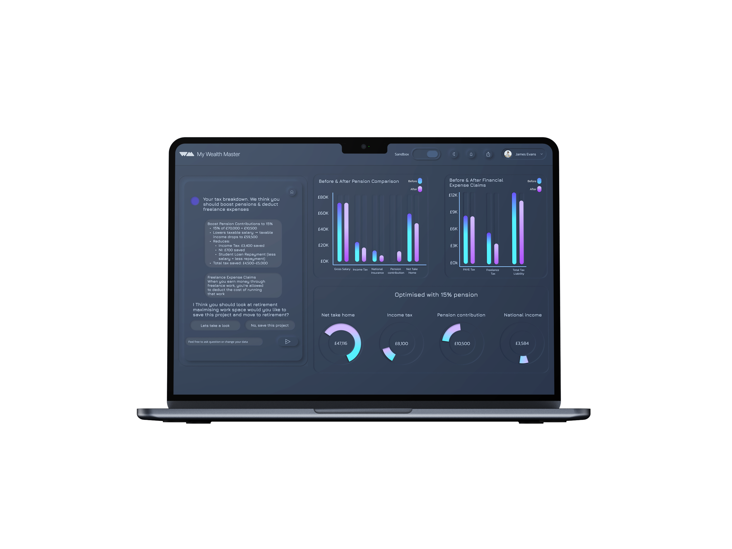
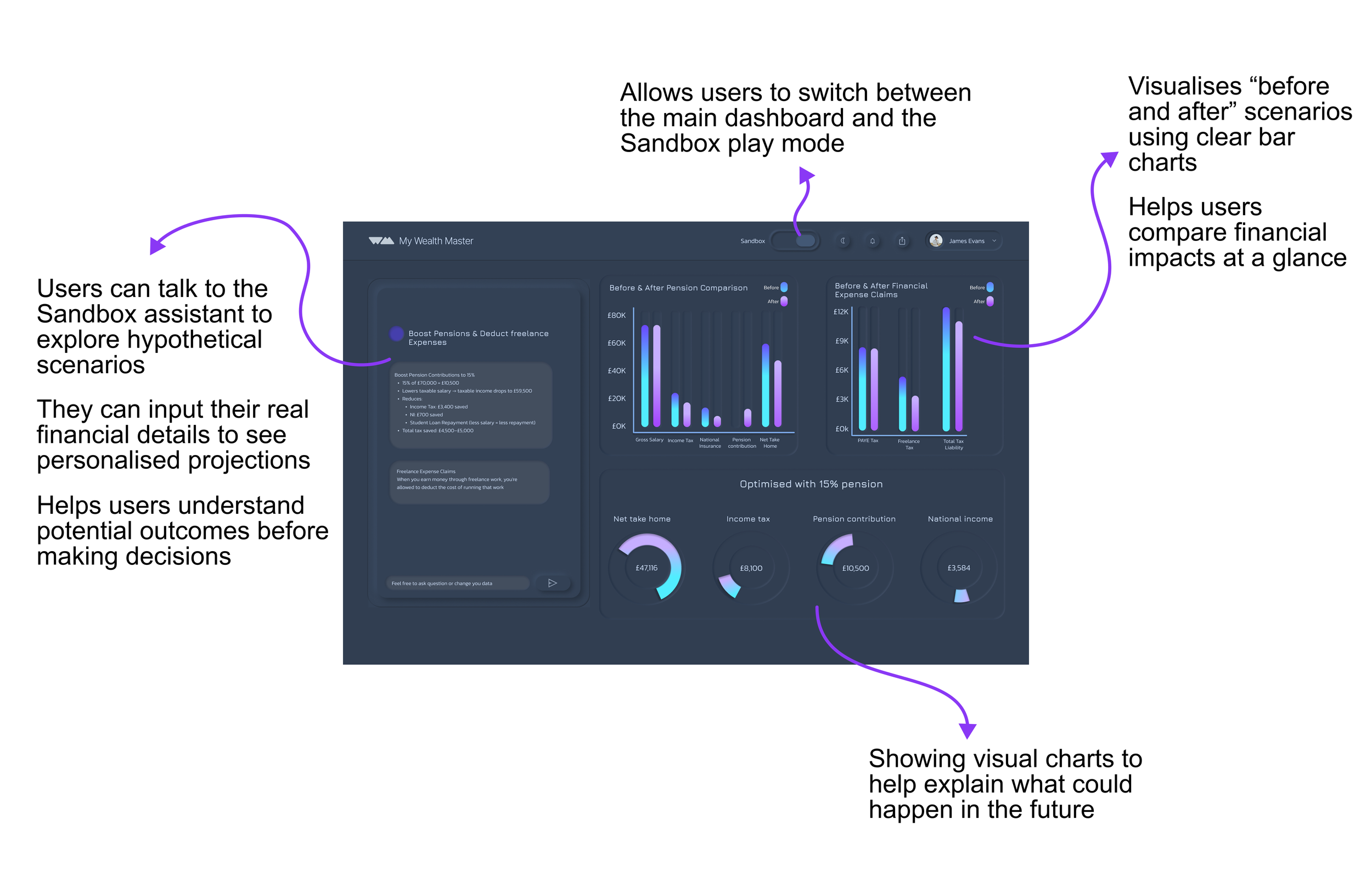
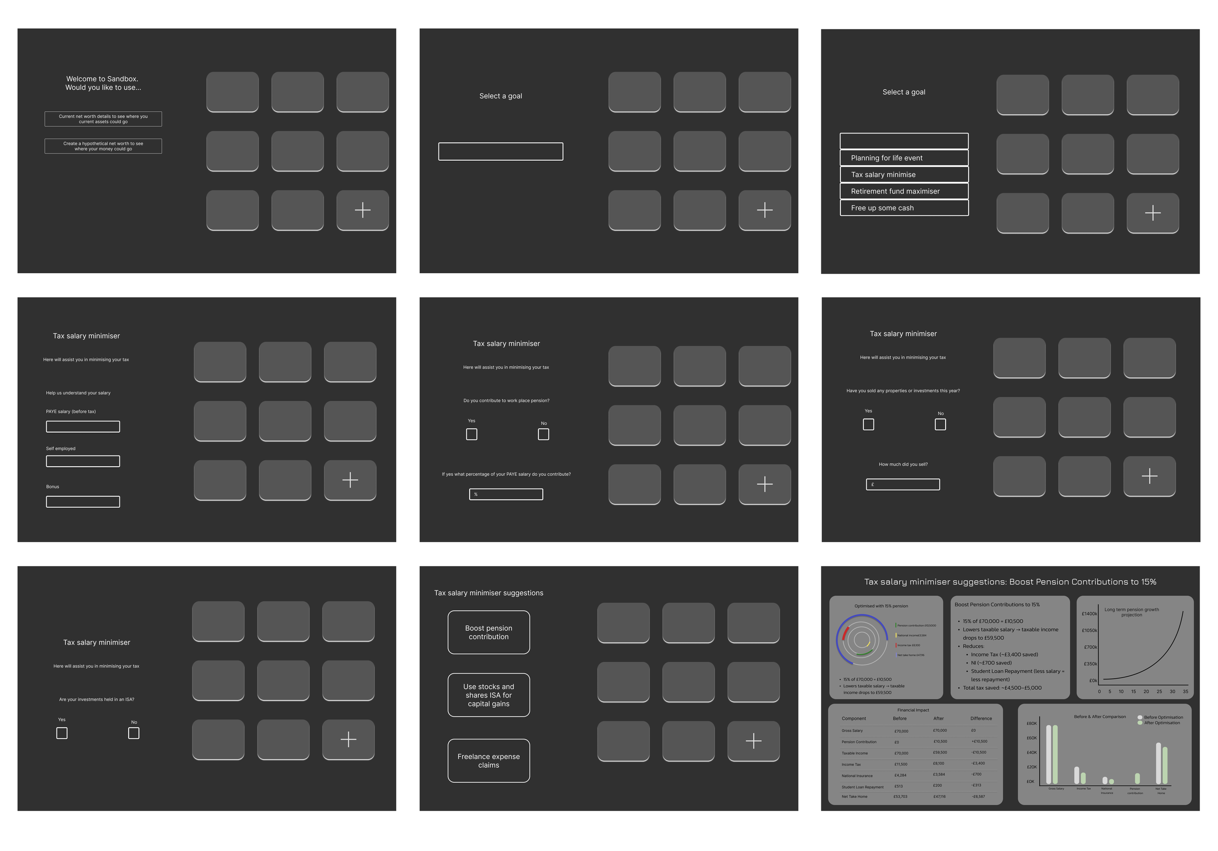
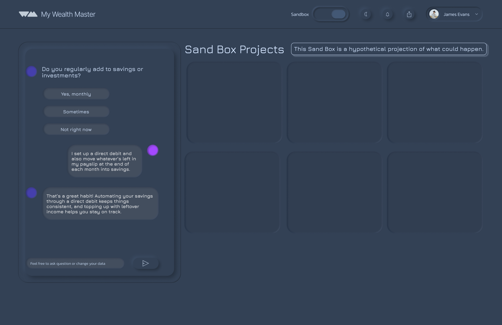
This flow is getting the user to play in the sand box. they need to answer a series of questions to get tailored advice on what to do with their money. This flow shows how a user can advice on tax minimsation.
Integrated AI into the flow to give users smart, personalised suggestions on how to manage and optimise their accounts more efficiently.
Through collaboration with my design team, we realised the onboarding flow already collects the key financial information needed.
Explored early, rough flows for the feature, including an initial questionnaire concept to help suggest the right ISA options to users.
Sand Box low fidelity
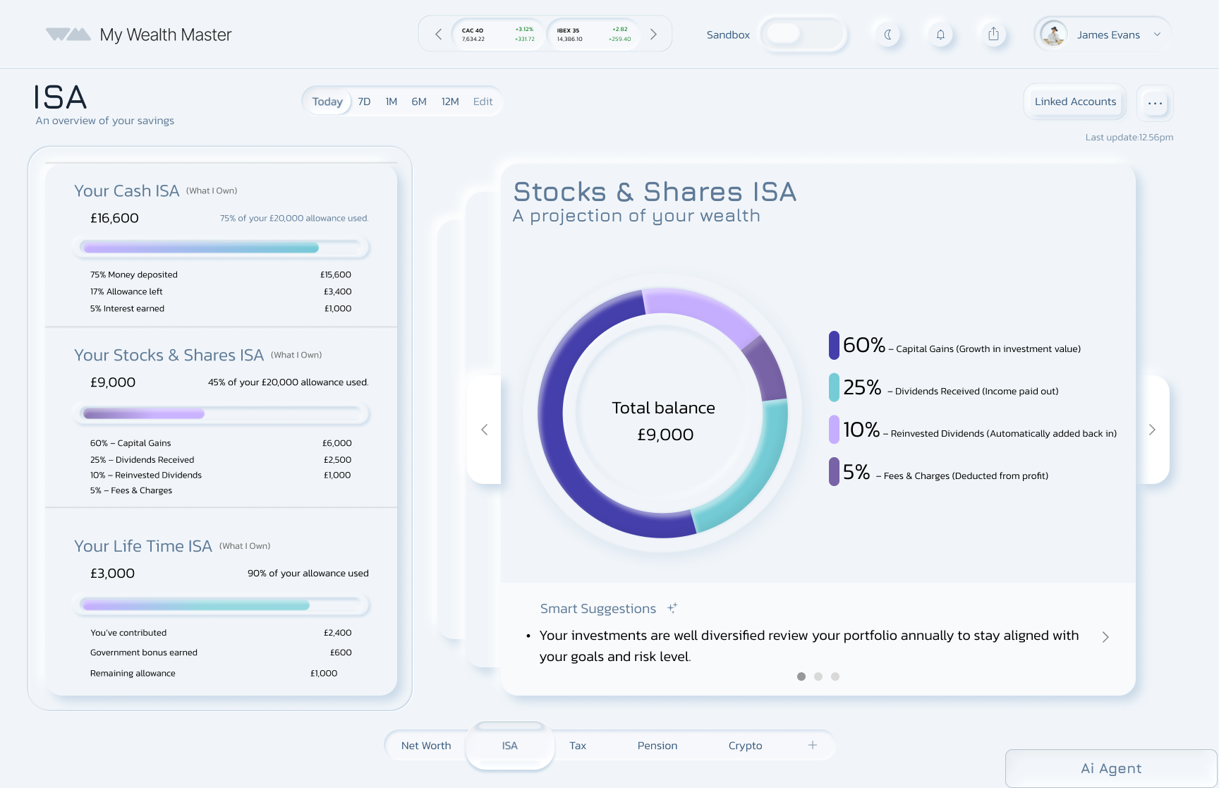
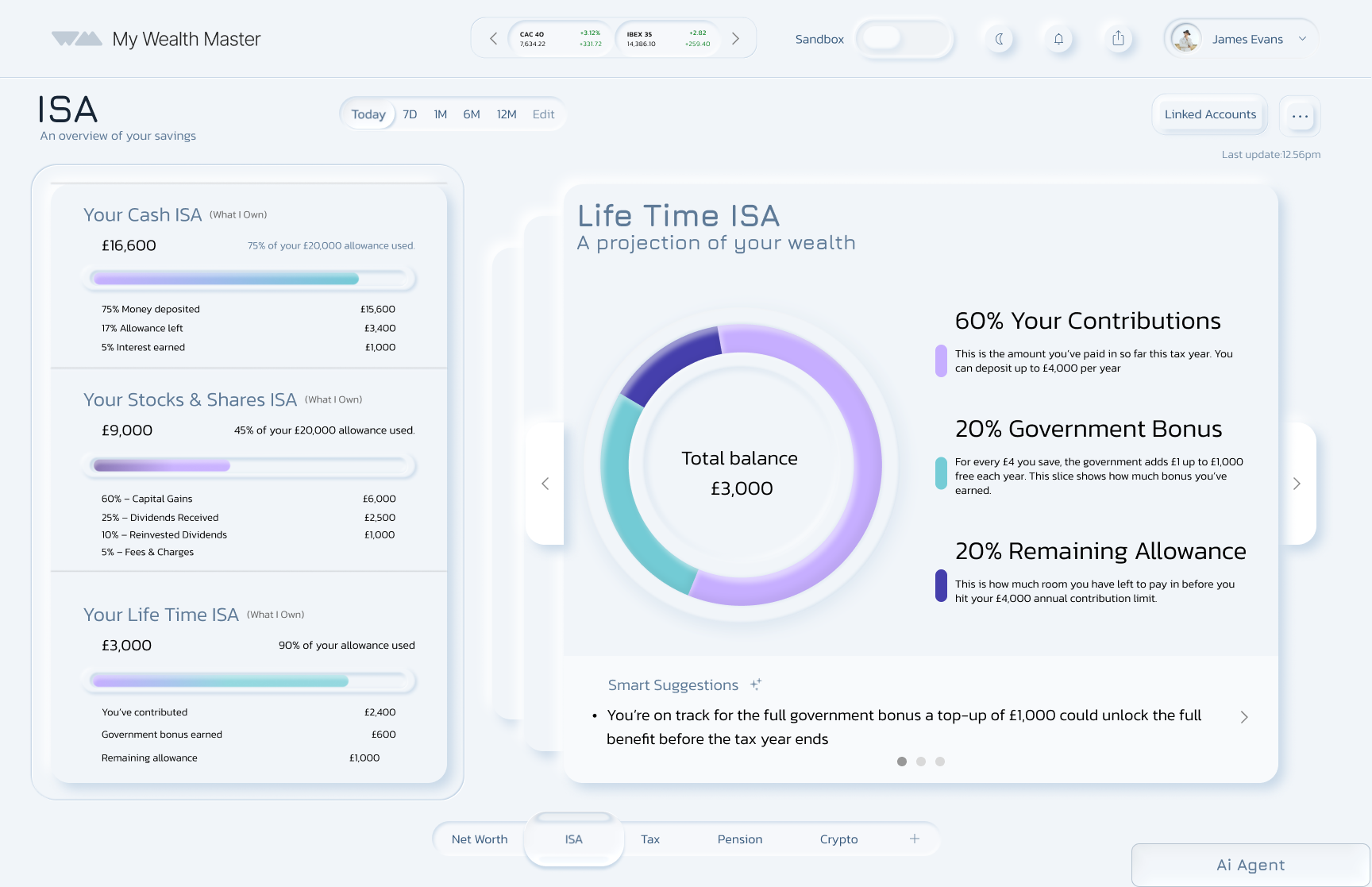
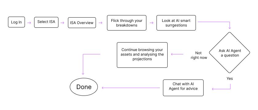
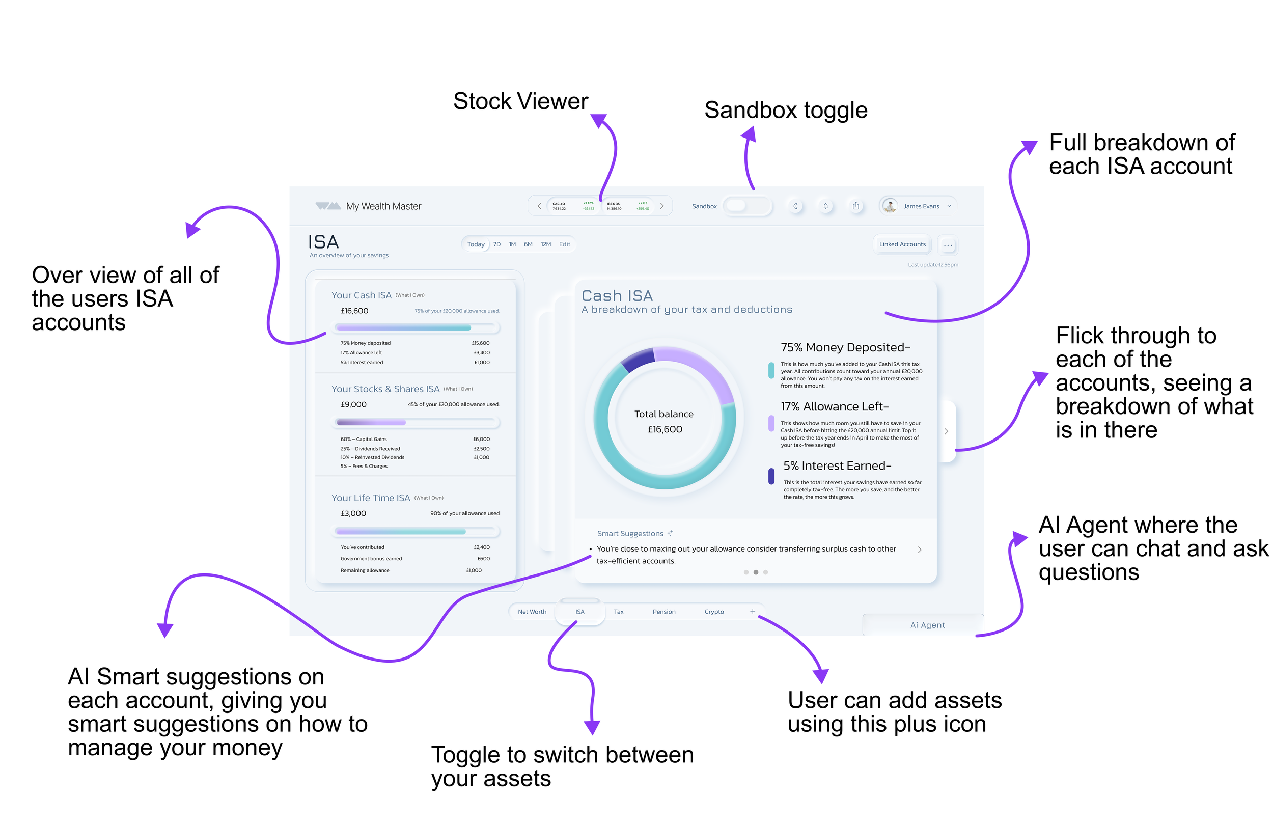
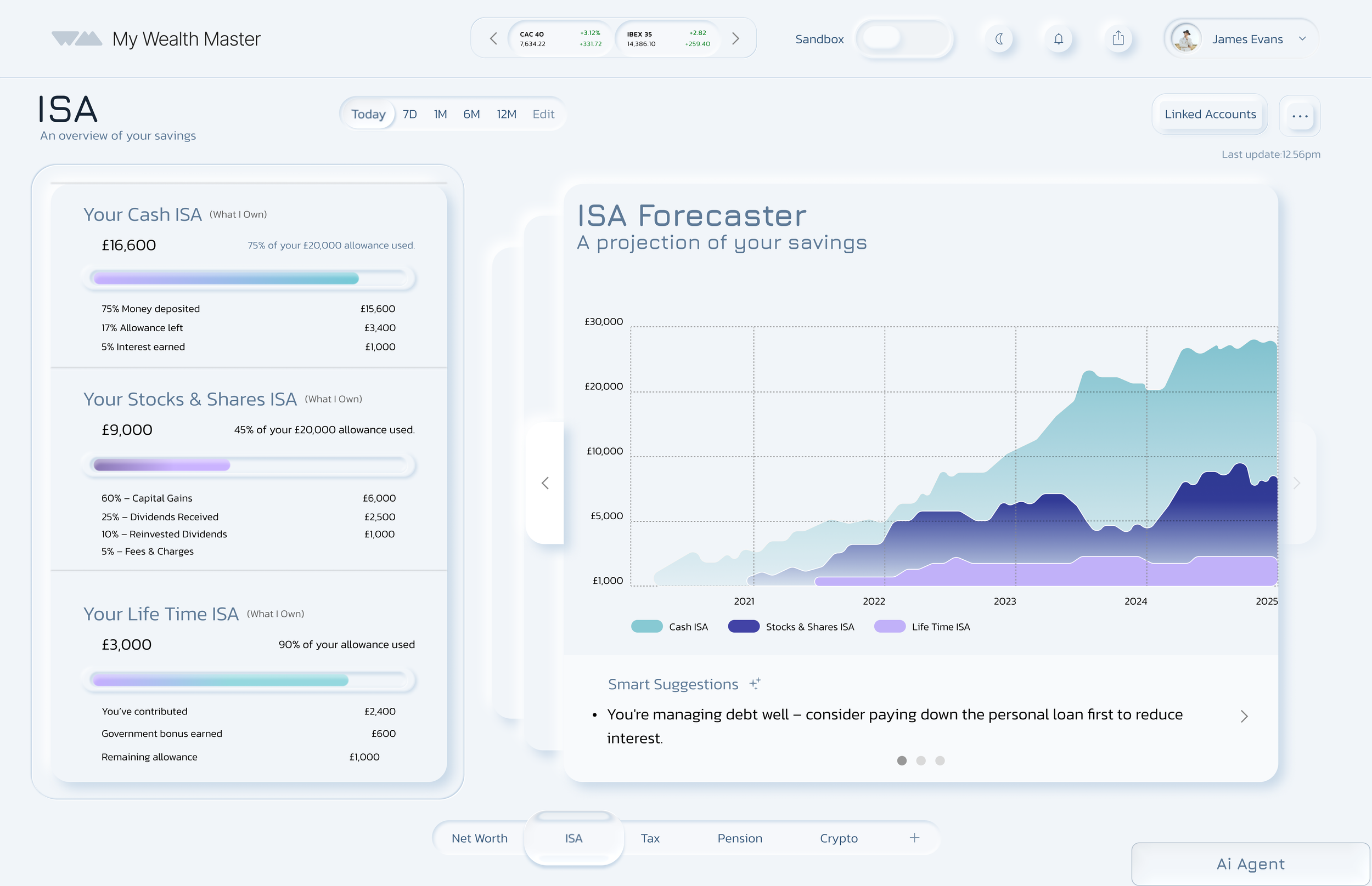
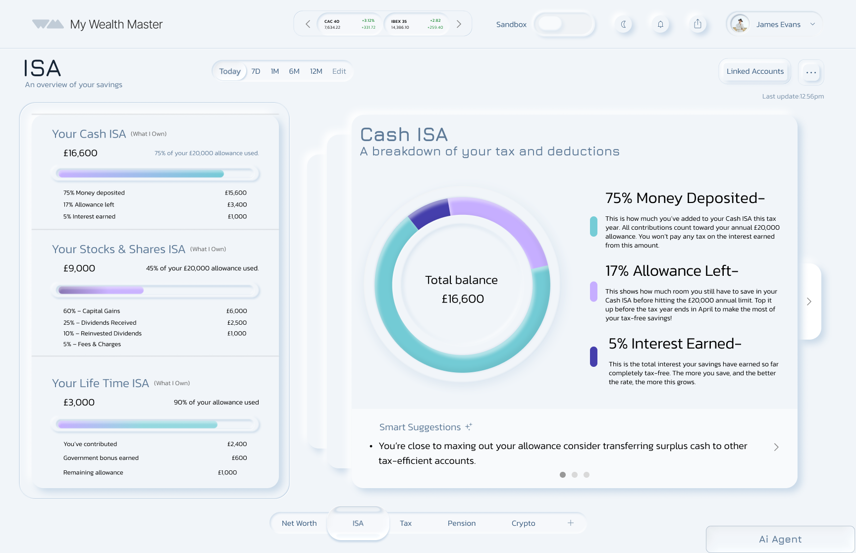
My goal is to allow a clear visual overview of the user's different ISA accounts. By selecting one of the ISA accounts, the user will have a full overview of what is in their account. They also have smart suggestions to advise them on how to utilise their accounts.
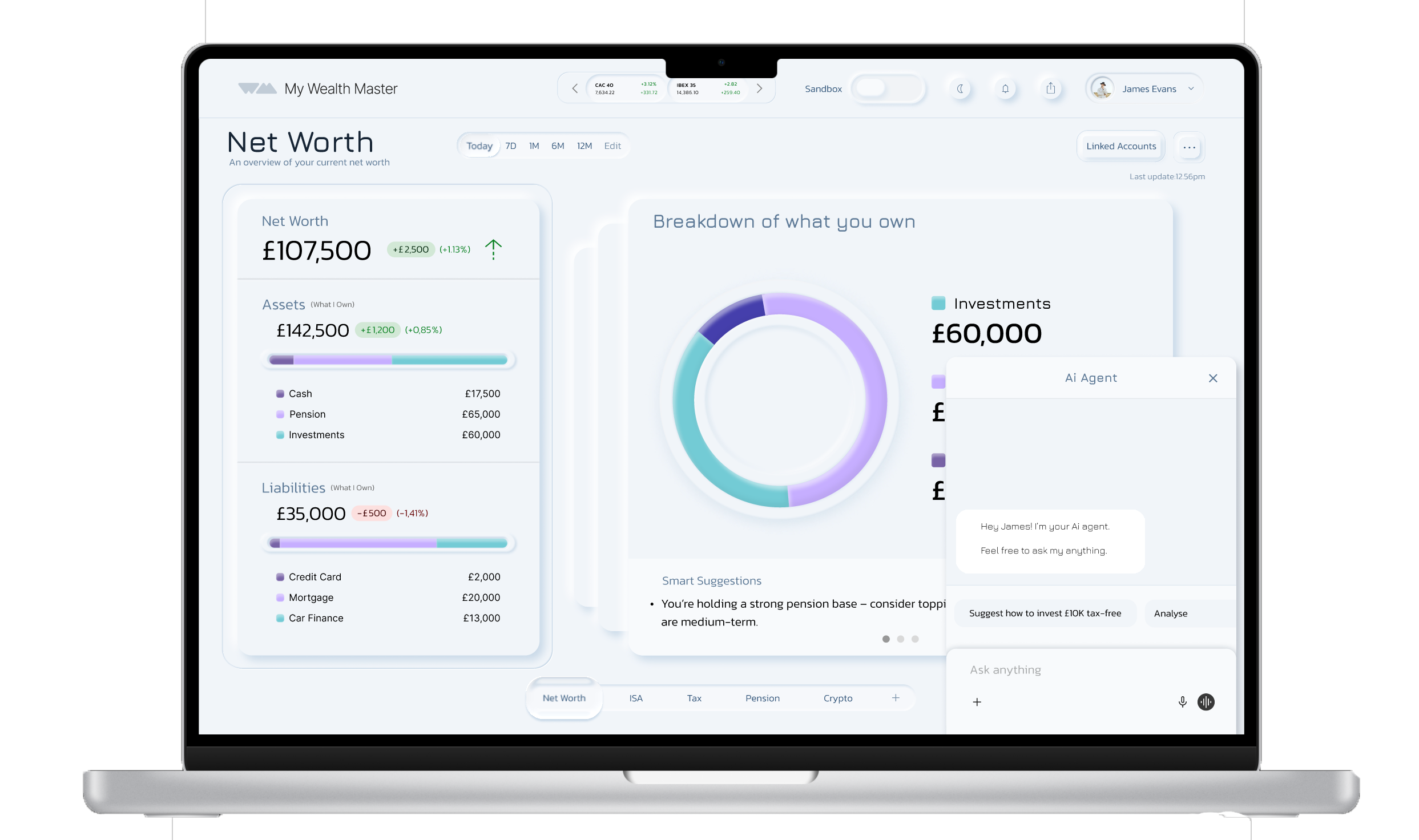
UNIFIED FIANACIAL DASHBOARD
An all-in-one view of finances with key metrics in one place. Users can explore details and take action across:
Net worth
ISA accounts
Spending trends
Investments
THE SAND BOX (MVP)
A safe, no-risk space where users can explore financial decisions with AI support. They can:
Test strategies
See how choices affect their future
Build confidence in managing money
For users who feel unsure or anxious about finances.
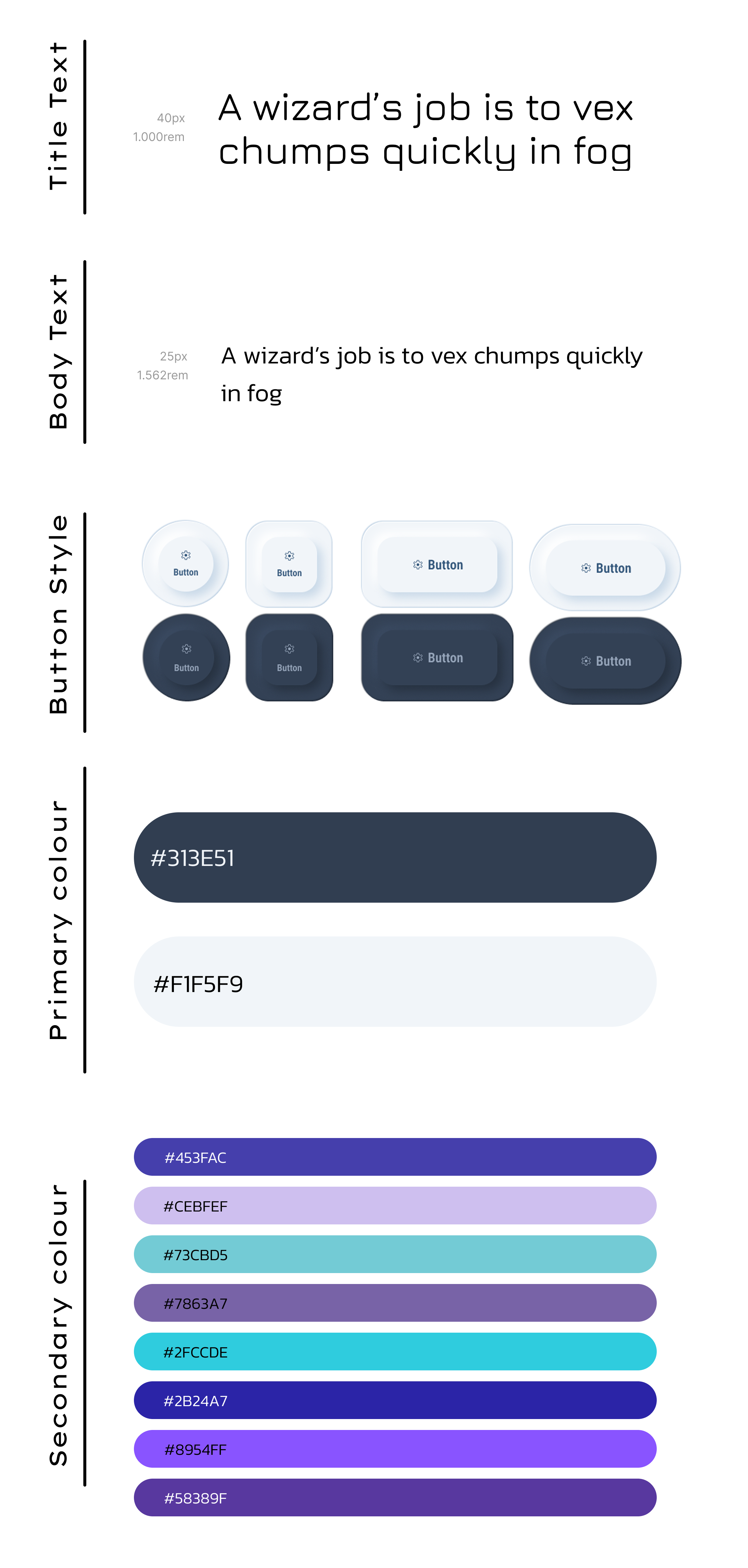
UI Design Choice
We chose a neumorphism design style, after having conversation with our stakeholder we came to the conclusion that we want a sleek, modern, and intuitive look.
To make financial data easy to understand, I incorporated bars, pie charts, and line graphs, giving users clear visual insights into their finances.
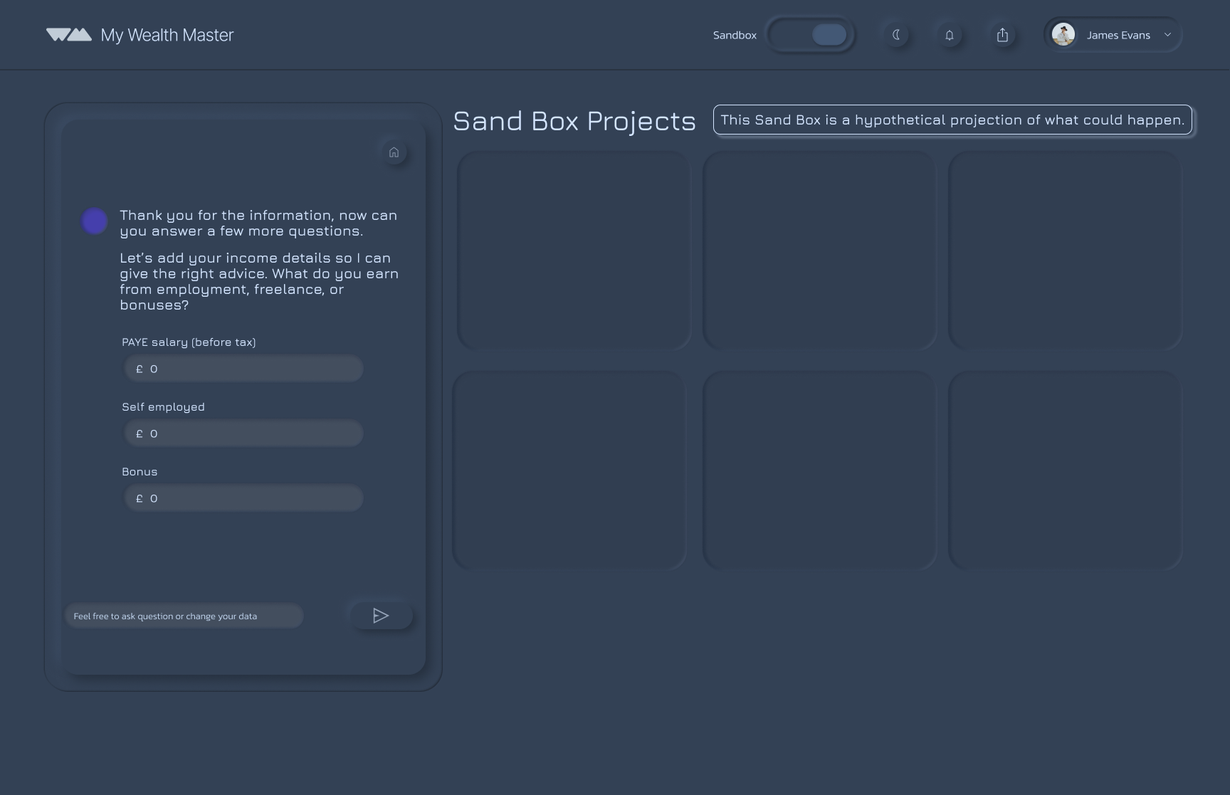
For the Sandbox, I introduced a distinct visual difference from the main dashboard. The Sandbox uses a soft grey, dark-mode style to signal that it is a separate, hypothetical space, ensuring users can clearly differentiate between real finances and simulations.
I worked in a team of four on this project. As we were each designing different parts of the platform, we decided to create the design system together to ensure our work felt cohesive and consistent. Our goal was to create a clean and modern aesthetic with a simple colour palette, using subtle accent colours to highlight key elements and guide the user’s attention throughout the platform.
Typography

Colours
Kept the colour system simple and minimal, using soft grey and off-white to avoid the harsh contrast of pure black and white.
Introduced a pastel palette of blue and purple variations as secondary colours on the main dashboard to highlight key elements, charts, and graphs.
Added brighter, neon accents specifically for the sandbox environment, reinforcing its more playful, experimental “play mode” and night-mode feel.
User Flow Demonstration
Chose a creative sans-serif typeface for titles to keep the design modern and readable.
Avoided using it for numbers and body text due to its dotted zero, which felt unprofessional for a financial platform.
Used Kanit for body text and numerical data to ensure clarity, legibility, and consistency across all screens.
Users can sign in with an existing account or create an account if they are a new user.

Once verified, users can link their bank accounts securely.
Main Dashboard
A bottom navigation bar highlights ISA, Tax, and Pension.

A “pulse” button lets users add or view other assets easily.
Sand box
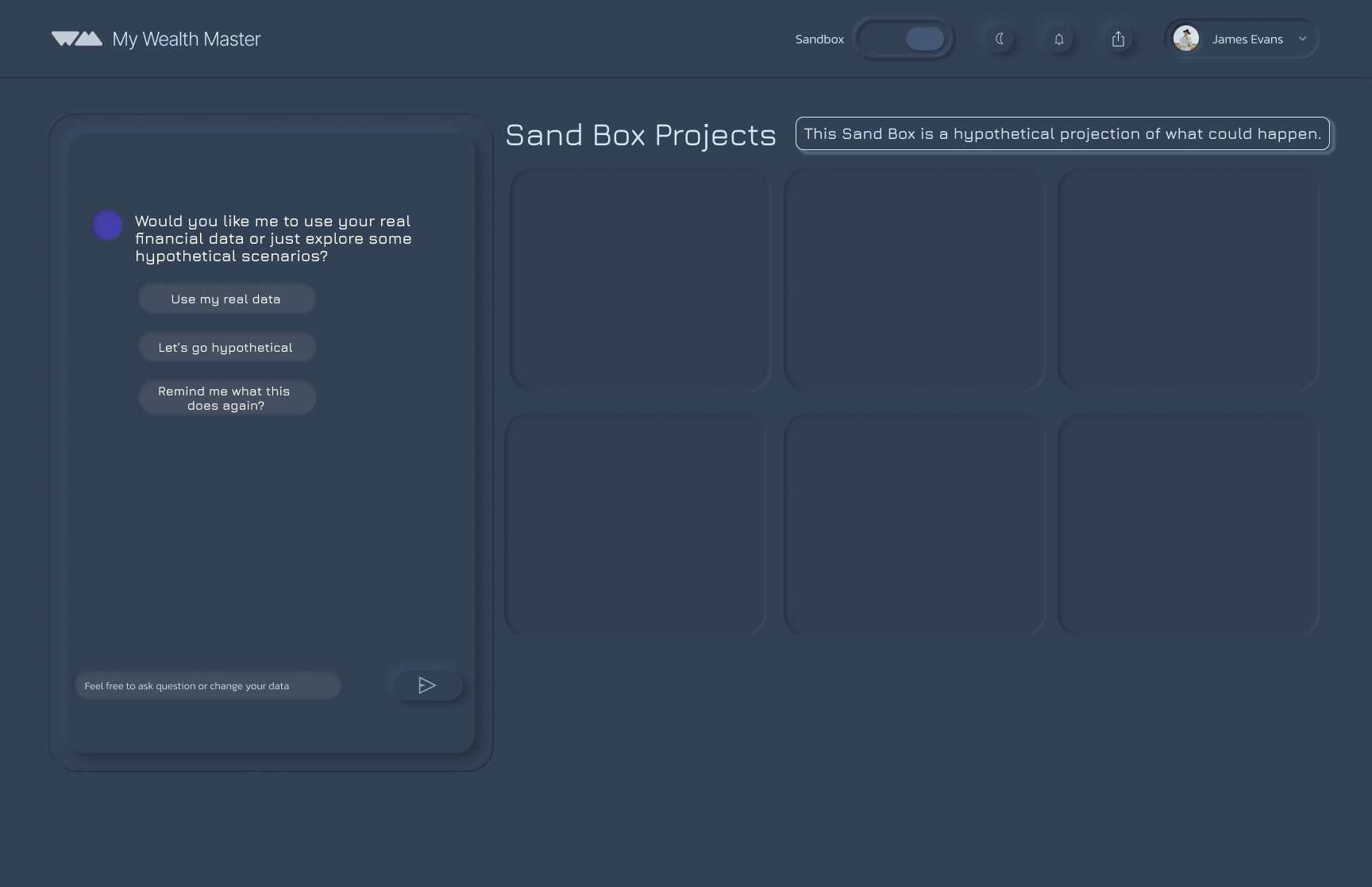
The Sandbox can be accessed from the main dashboard using a toggle. To make the distinction clear, it uses a different colour scheme.

AI question prompts to get all the information to answer the question
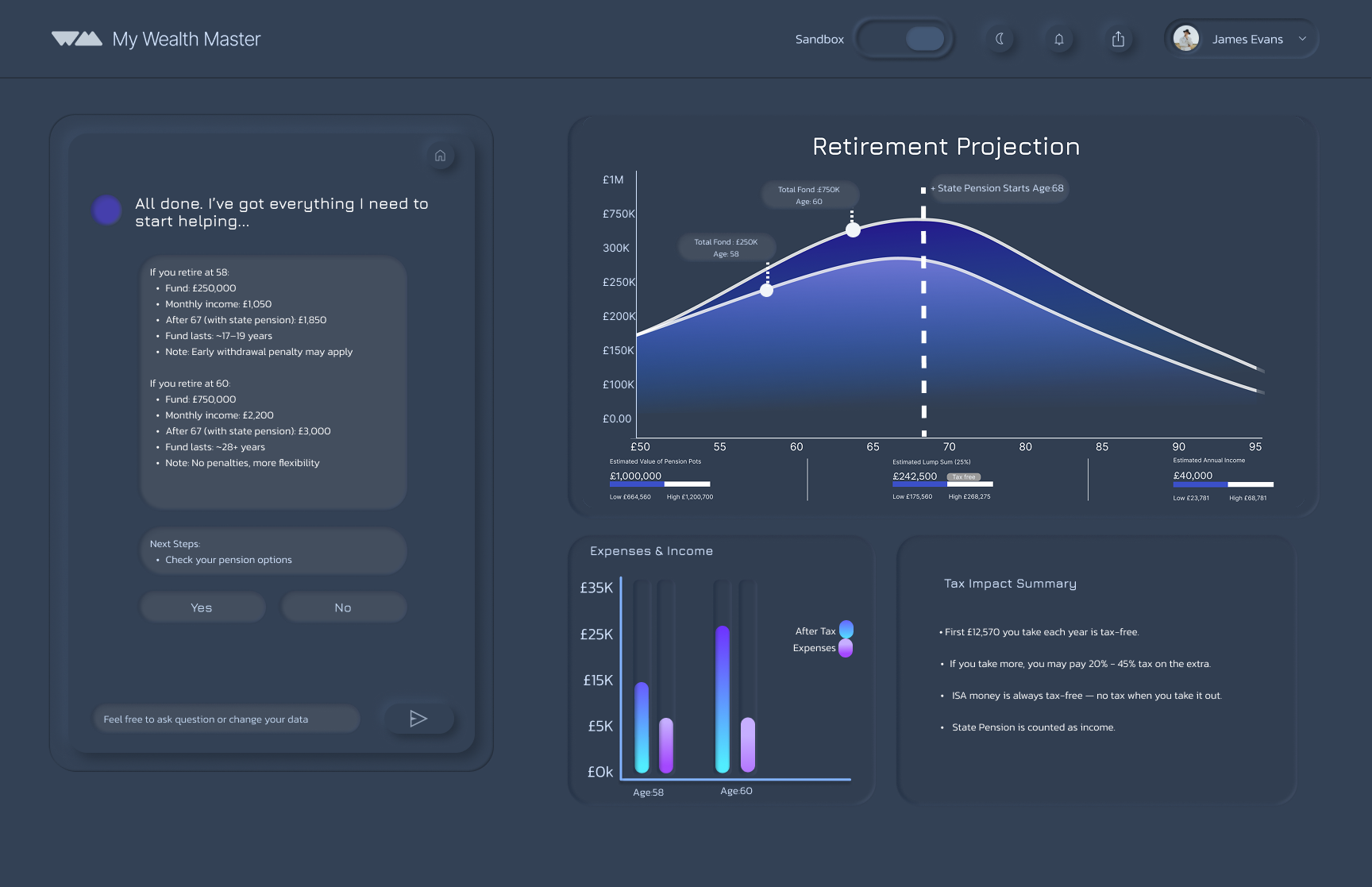
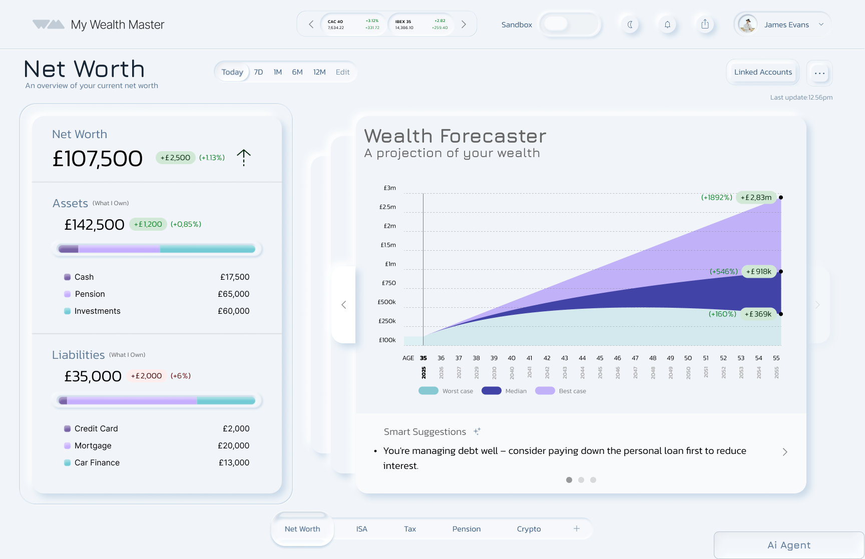
Retirement Projection
The projection graph provides a clear view of future finances, while AI guidance makes complex planning simple and reassuring.

Discover, Define, Develop, Deliver
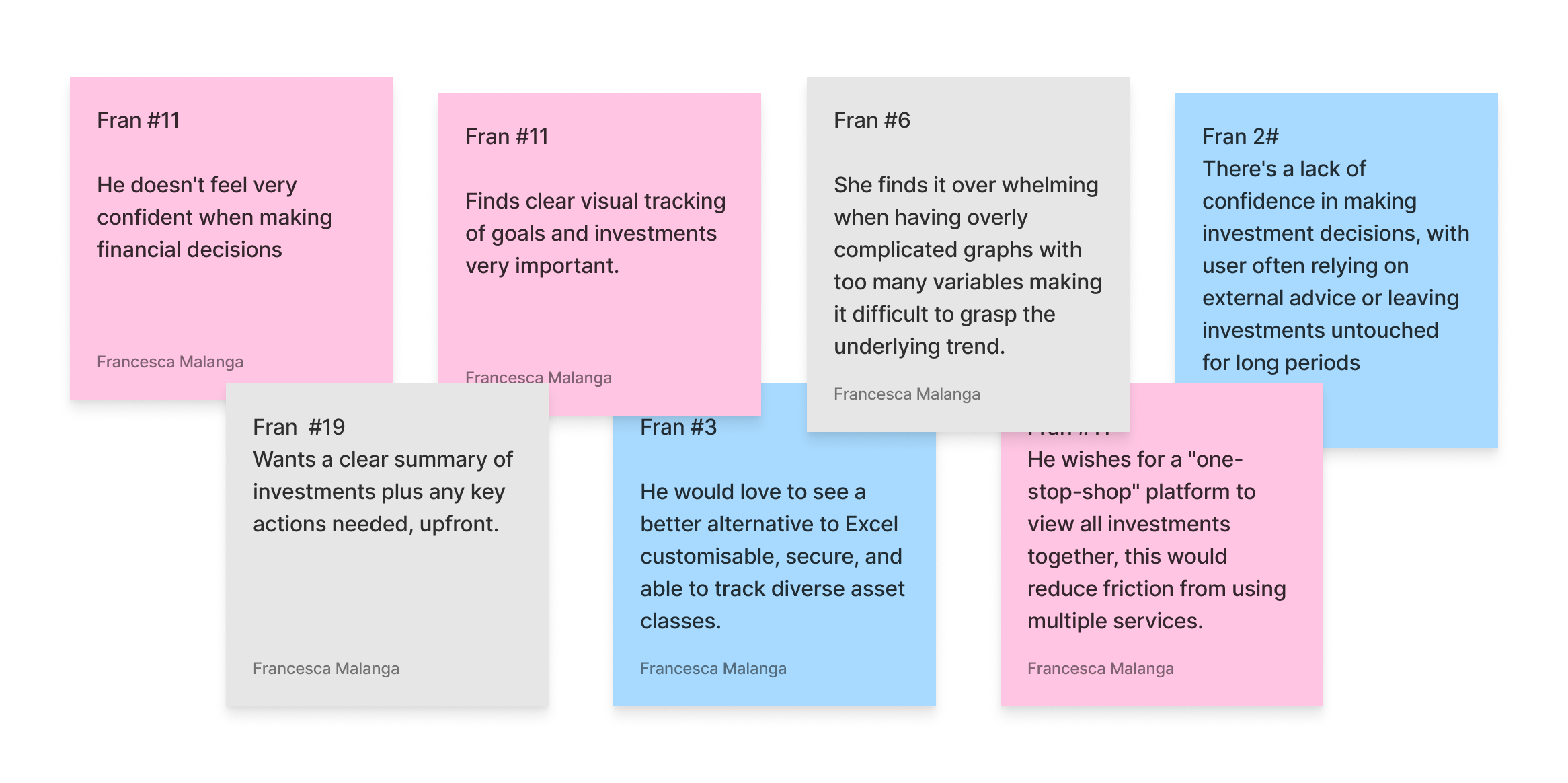
User Research Findings
1
2
3
LACK OF CONFIDENCE IN FINANCIAL DECISION MAKING
Users feel unsure about how to manage their money. They want tools that guide them, not just display data.
ALL IN ONE FINANCIAL MANAGEMENT
Users don’t want to juggle multiple apps. They’re looking for a single platform that can track, manage, & improve their finances in one place.
SIMPLICITY IS ESSENTIAL
Users are overwhelmed by complex financial tools. They want a platform that’s intuitive, streamlined, and easy to navigate. No jargon, no clutter.
Data
KNOW YOUR AUDIENCE


SEAMLESS ONBOARDING
A smooth, simple start that gets users engaged quickly. No long forms or complex setup, just immediate value.
After the ideation phase, I worked on designing two key areas of the product: The Sandbox section and the ISA section that is within the main dashboard. I began by creating user flows to see how these sections should work for the user to guide the experience.
Data
Improving usability on a product can lead to an increase in conversion rates of up to 87% (Source: Jakob Nielsen's analysis of 66 case studies).
ISA Flow
Persona
The Design Challenge
Name: James
Age: 35
Role: Project Manager
Location: Highbury & Islington
A LITTLE ABOUT HIM
He is planning to buy a house
Financially aware and has some savings and investments.
Is open to Ai
Confident in day to day finances and budgeting.
GOALS & MOTIVATIONS
Align investments with life plans (home, family, future kids)
Build strategies for changing market conditions
Stay organised with all assets in one place
Learn more about personal finance
Feel confident with an emergency buffer for security
HOW MIGHT WE help to make it easier to keep in control their investments and financial strategies?
HOW MIGHT WE give them a clear, all-in-one view of their finances and goals, so they feel in control, stay motivated and easily understand their financial situation?
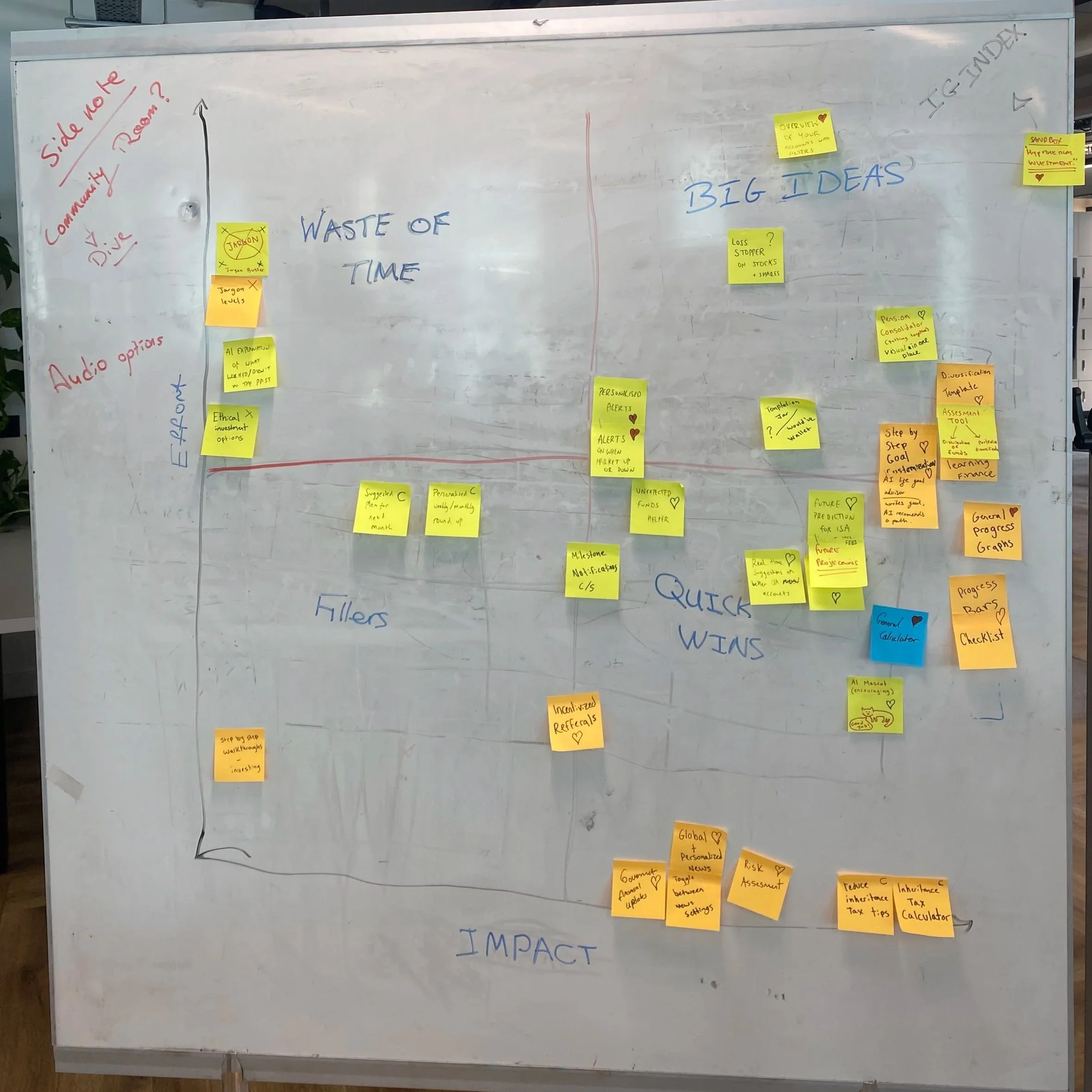
To help get the project under go we decided to make a High impact Low effort matrix. This helped us understand what we would like to priorities, we ideated and put the main ideas on the board in an area we found best.
Deliver
Design System
Onboarding
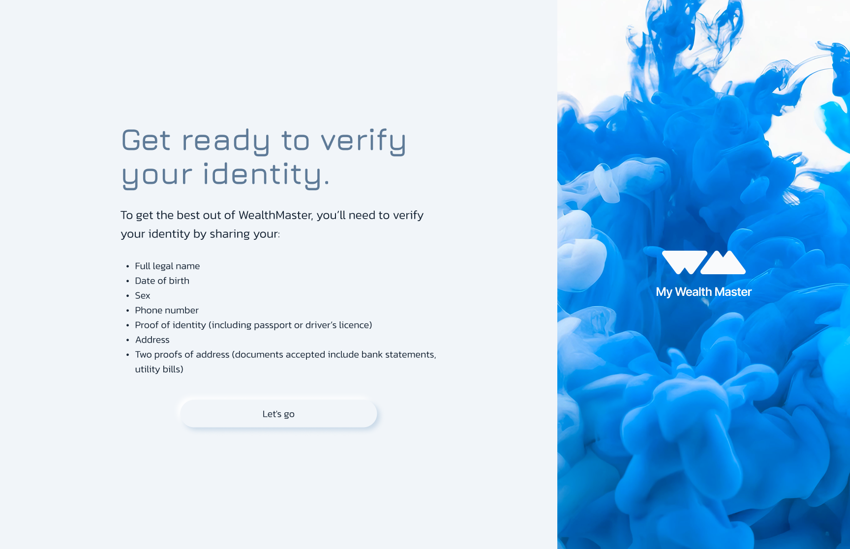
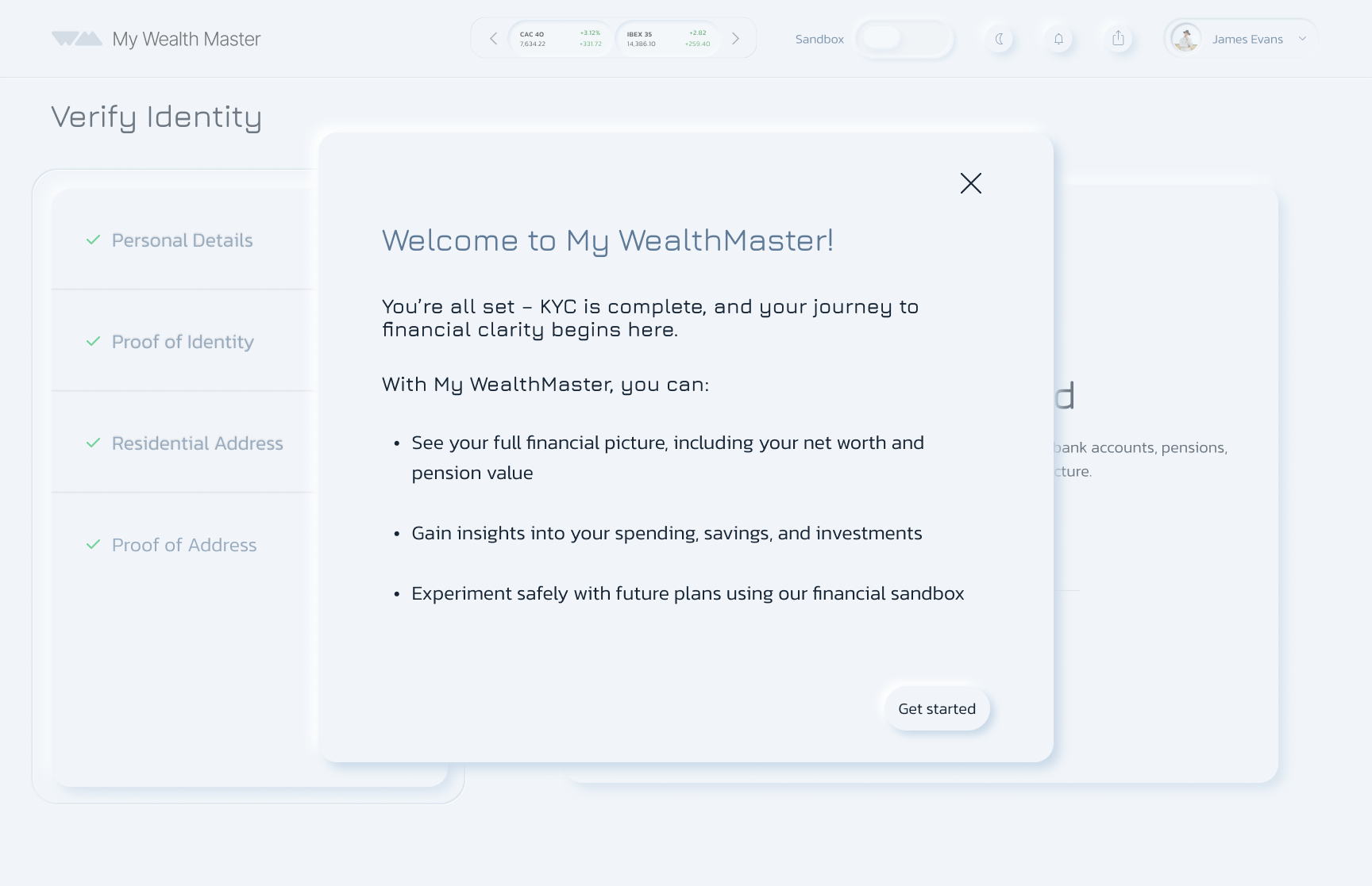
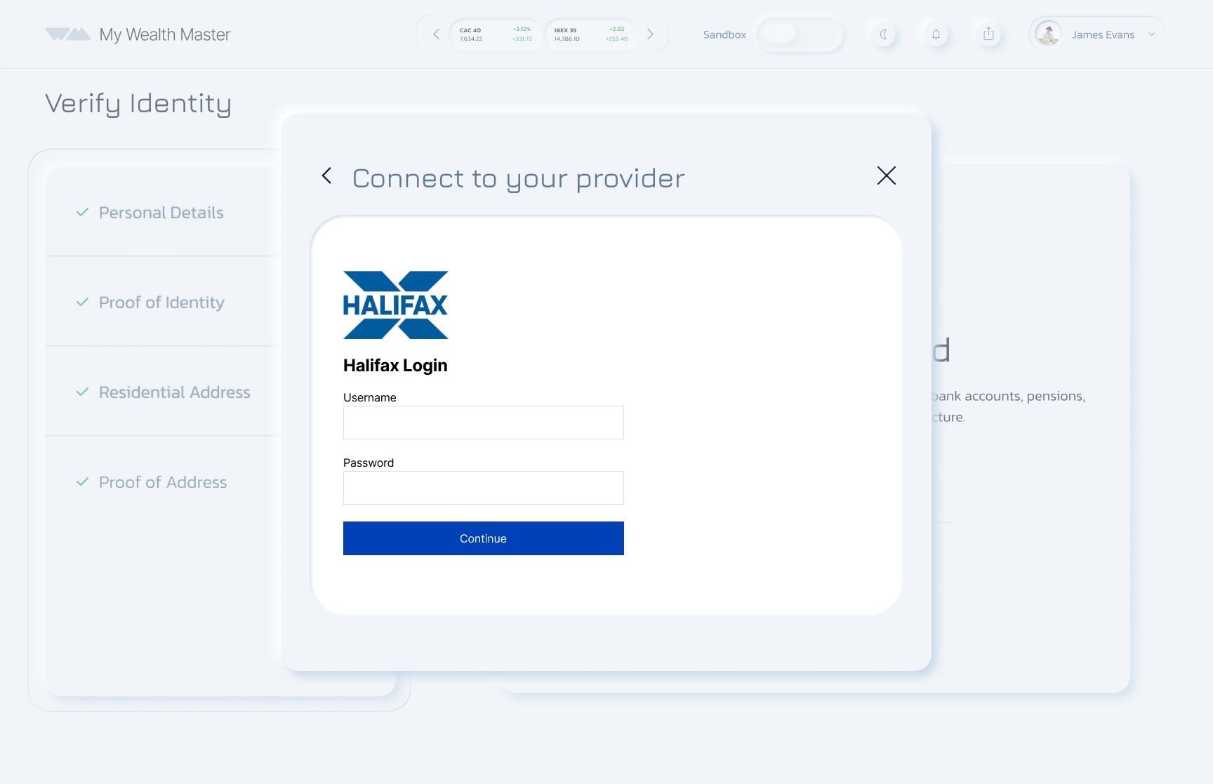
Because this is a financial app, identity verification is required.
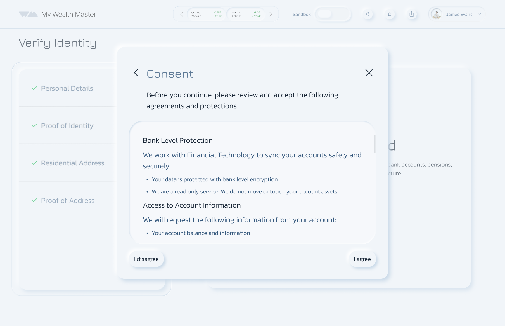
Each connection requires verification with the bank provider for added security.
After onboarding, the dashboard presents all linked accounts in a clear, visual layout.
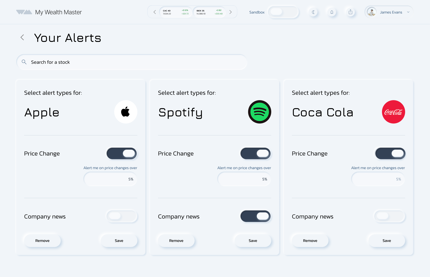
Alerts
Low Fidelity
ISA low fidelity (main dashboard)
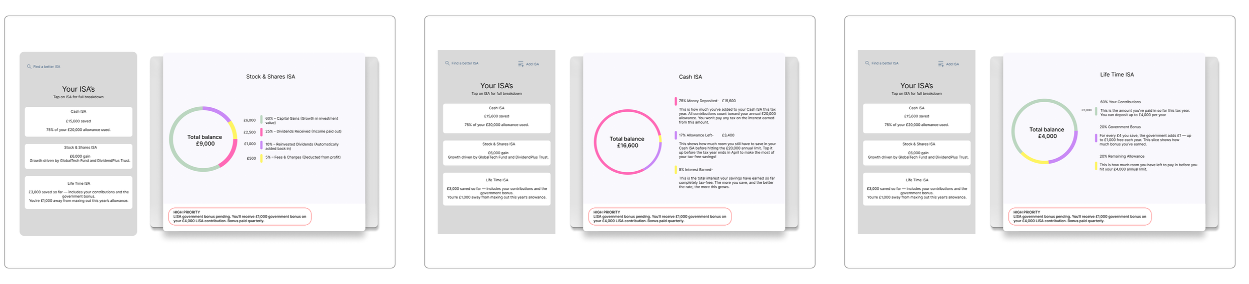
Dashboard Overview
Users can set up stock alerts to stay informed.
Toggle settings allow them to choose how and when they receive notifications, including percentage change updates.
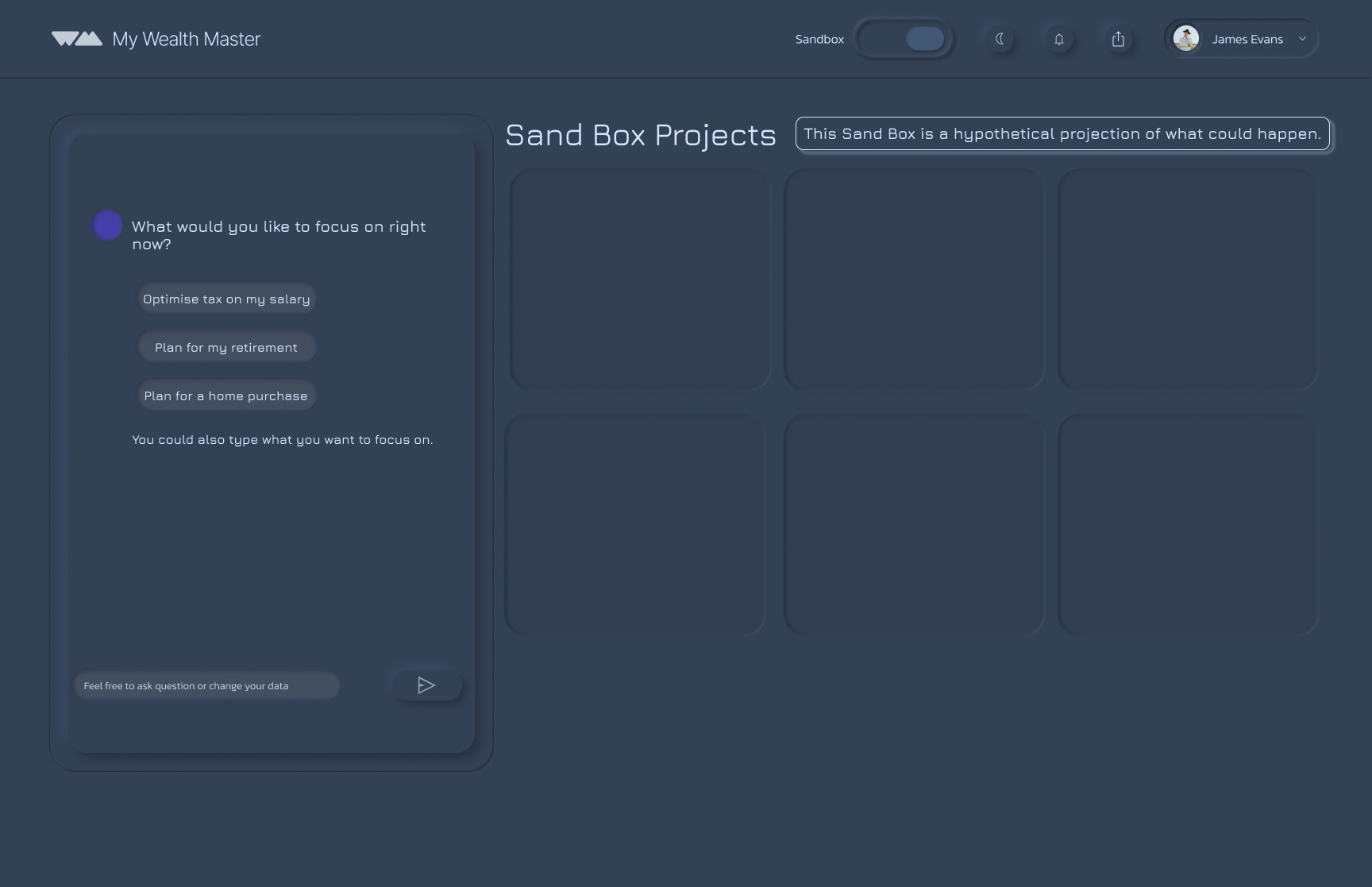
The AI assistant Sandbox prompts you with asking if you would like to run with either real account data or a hypothetical amount.
Powered by AI, it generates personalised insights based on the current financial market, helping users build knowledge and confidence in their financial decisions.
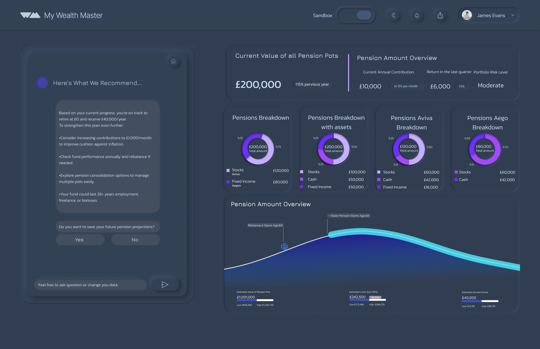
Pension Overview
A headline figure and pie charts give clarity and control, with AI insights adding personalised support and stability.
Next Project

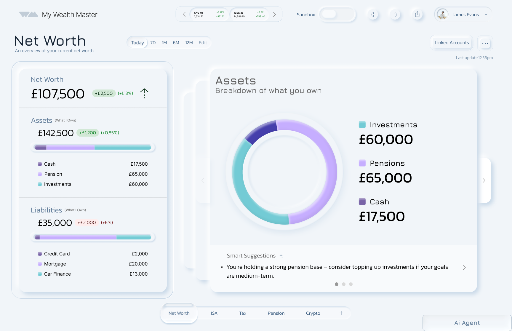
The first page shows your net worth, with AI support breaking down your assets.

Almost one-third (31%) of 18–34-year-olds admit they do not understand stocks and shares, and 28% are unsure where to invest. (Source: Royal London, 2025)
Users can test scenarios such as:
What happens if I invest in a specific area?
If I take a pay rise, how should I handle the added tax?
Save your project to track progress over time, revisit it to ask new questions, and adjust amounts as your plans change.
Shows all three projects in one place, giving users a clear overview.
The AI chat box lets users start a new project conversationally.
Clickable project boxes, allowing users to edit, develop, or adjust scenarios at any time.
Project Reflection
Being part of this project was genuinely inspiring, especially working alongside such a supportive and creative team. I learned how essential it is for collaborative design to feel connected from the start. We divided the platform into clear sections, but when we combined our work later on, we found overlaps and inconsistencies that disrupted the flow. If I were to do this again, I’d push for earlier alignment so our individual ideas could merge more naturally into one unified experience.
In future collaborative projects, I would prioritise:
Early integration of designs
Cross-team check-ins
Continuous validation of flow and usability
Began as a redesign, but a full rebuild was needed
Restarted from scratch to focus on real user needs
Learned users struggle with clarity and confidence in managing money
Shifted vision to address these deeper challenges
Identified AI as essential for smart, personalised support
Evolved My WealthMaster into a financial assistant that guides users with clarity and insight
The Solution
Provide an easy, all-in-one overview of personal finances, bringing everything into one place instead of switching between multiple banking apps.
Create a safe space to learn how to invest and manage money, supported by AI guidance in a dedicated Sandbox area.
Help users stay organised and feel confident when making financial decisions.