Colour Direction
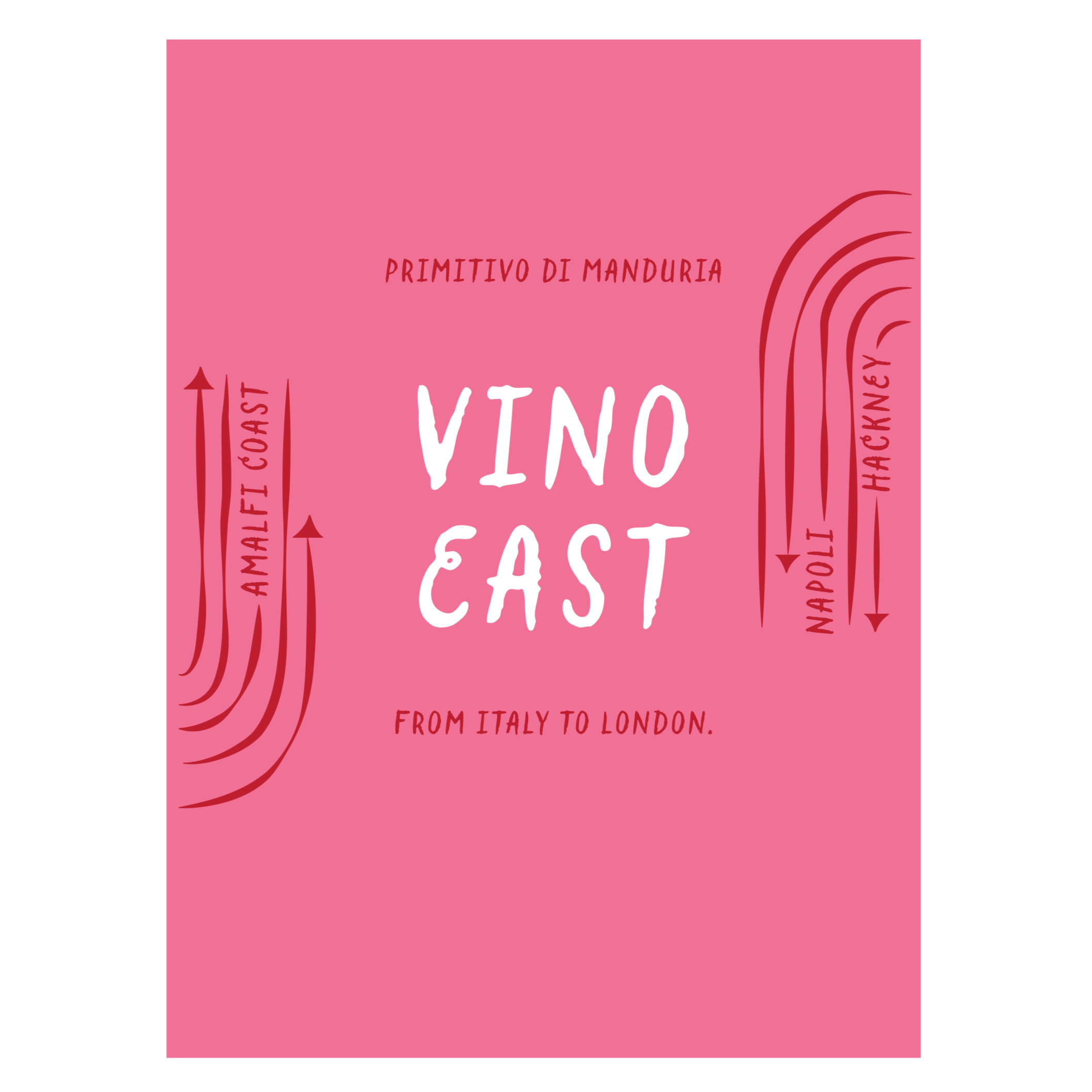
Vino East
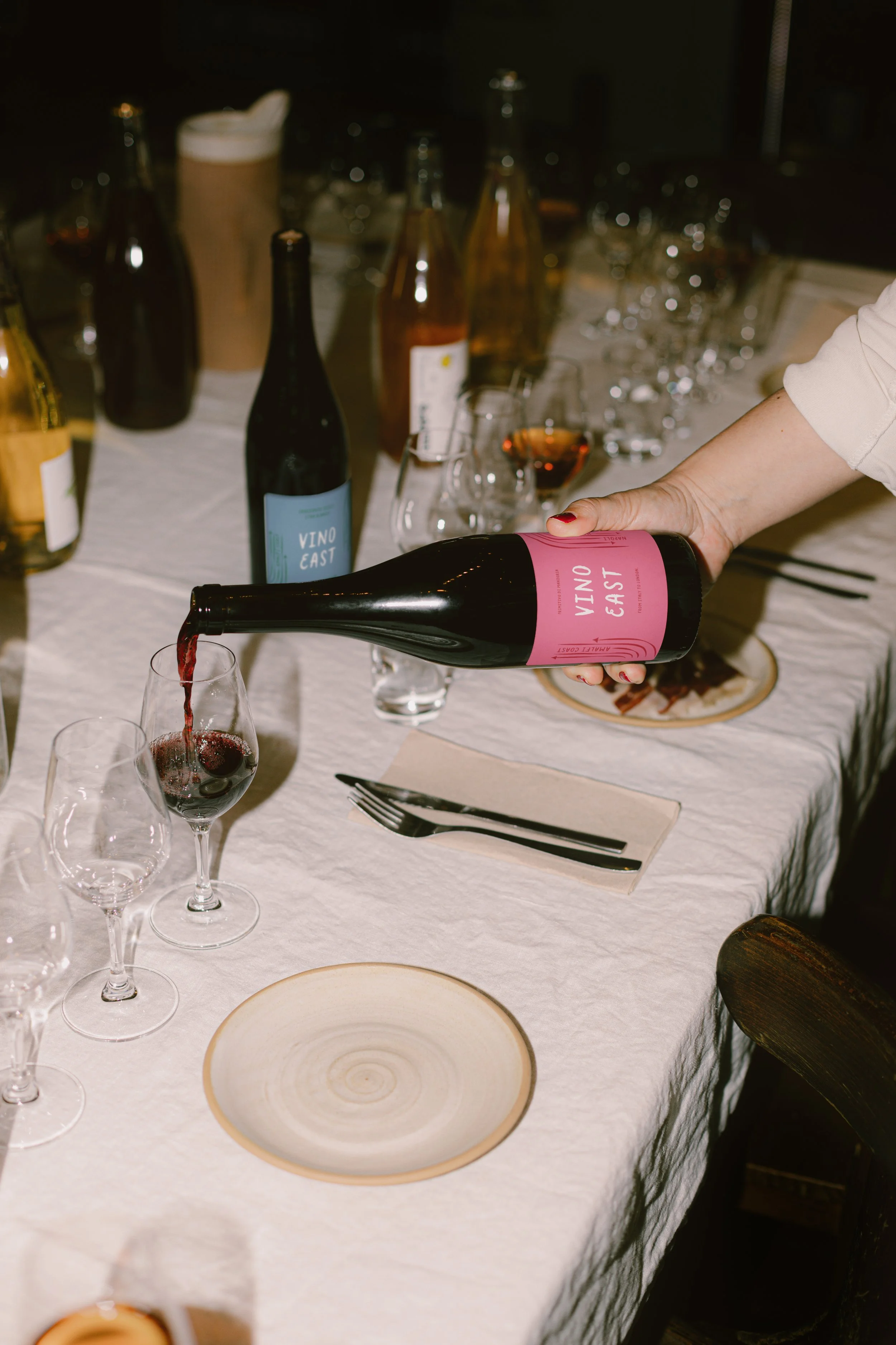
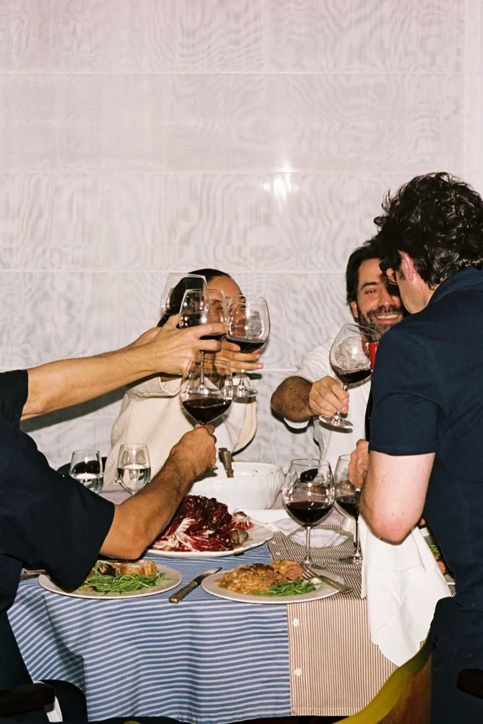
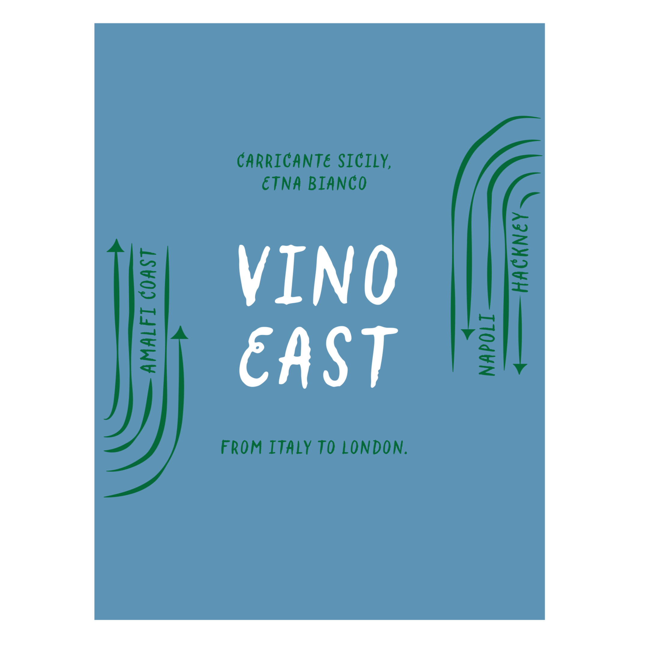
Vino East Wines is a family-run business with deep roots in Italian winemaking, now bringing its passion for wine to East London. Originally from the south of Italy, the family grew up in the vibrant streets of East London. Now, they are looking to create a distinctive wine label and a wine menu design. Merging the warmth of Italian tradition with creativity of East London,
Software Used
Design Direction
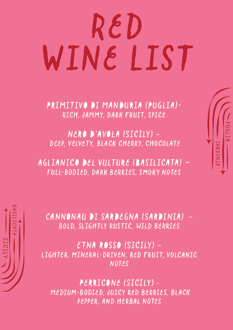
The arrows in the design represent a sense of direction, inspired by the family’s grandparents who migrated from Italy to England and built new roots and opportunities in East London. The curved lines symbolise the roads and roots they established, reflecting both their journey and the progression the family has accomplished over time. The playful, quirky typography adds a relaxed, uplifting feel celebrating that winemaking is not just a business but also a family hobby. At the same time, it captures the vibrant, creative character of East London
Adobe Illustrator
Adobe Photoshop
Adobe Indesign
Red Wine List
White Wine Label
White Wine List
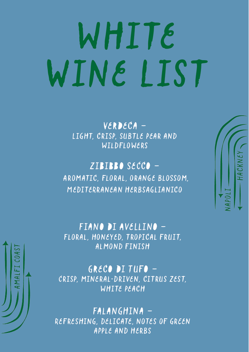
For the label and wine list colour designs, I developed a simple but striking colour system to distinguish the wines: the pink label with white and red lettering represents the red wine, while the blue label with white and green lettering represents the white wine. This approach not only makes the wines easy to identify but also reflects the playful, modern edge of the brand while staying true to its Italian heritage.